Lamy Safari Pink

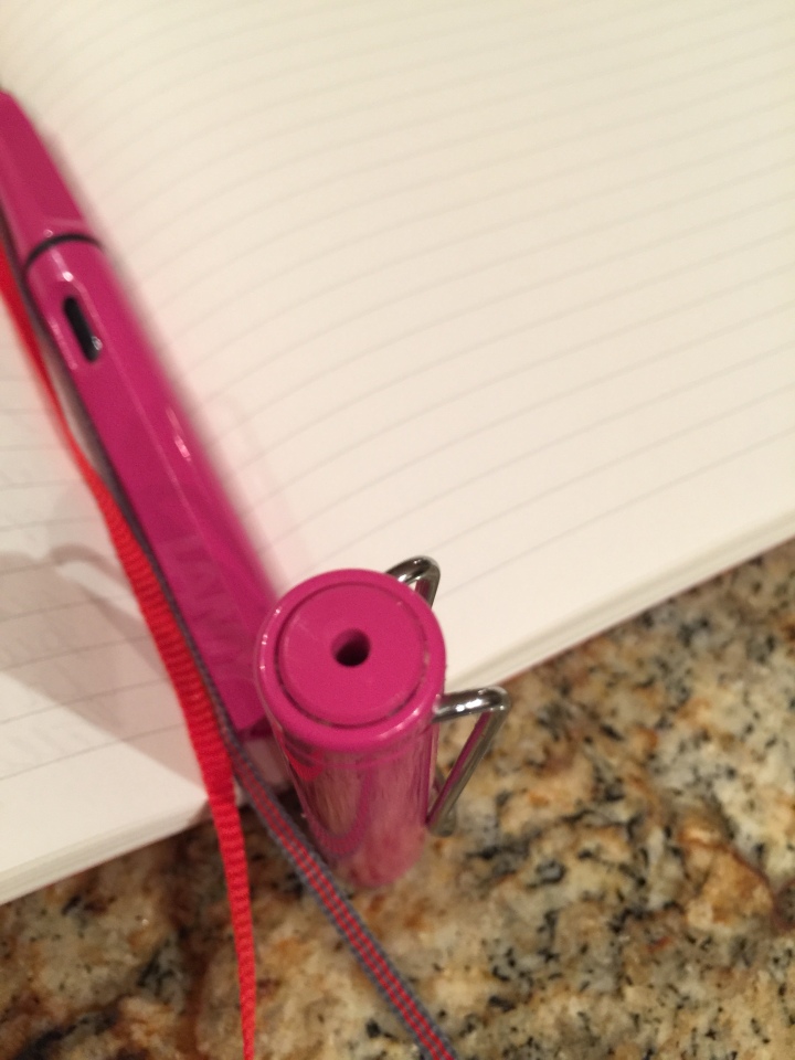
I wonder how many fountain pen addicts began with a Safari? My first was a Lamy Joy that I picked up to experiment with mixed media journalling. I didn’t get too far with that but while I was nosing around the store shortly thereafter, I picked up this bright pink Safari. I was advised that it was a limited edition. I didn’t know what that meant exactly and I still don’t. I do know, from the finial, that this is the 2009 limited edition and that seems about right timing wise. The fact that there have been several of these limited editions (and hence the finial identification) lifts my eyebrows at the designation. Right now it can be purchased on JetPens.

I have nothing new to say about this pen: the internet is stuffed to exploding with reviews and opinions.

For me, my Lamys (I had a yellow Safari that I lost and I just acquired a Dark Lilac) have been workhorses. I have multiple converters and multiple nibs and I have never had a single problem with filling them, cleaning them, ink flow, changing nibs, or starting.  They just work every time, all the time. The triangular hold doesn’t bother me, nor does the cheap plastic (I grudgingly admit that the matte finish on the Lilac at least makes it look like a grown ups pen). Everything: pen, nib, converter is all quite cheap and it is easy to acquire an entire menagerie. I have not been tempted to purchase the aluminum version or the demonstrator version.

Changing nibs is easy and there are plenty of instructions out there on how to do it including YouTube videos. The converters are sturdy and last forever. They hold a good amount of ink. The ink viewer in the barrel of the pen is extremely functional. It takes no skill to break this pen down, clean it entirely and put it back together again.

Sometimes, things just work.

Lamy Safari Pink.jpg

On Hand

  1. Lamy Joy (Calligraphy) 1.1, 1.5 and 1.9 steel nibs
  2. Lamy Pink Safari Limited Edition 2009
  3. Lamy Lilac Safari EF nib
  4. Lamy AL Star F nib
  5. Lamy 2000 F gold nib
  6. Franklin-Christoph Pocket 66 with steel 1.1 stub
  7. Franklin-Christoph Model 20 (special edition for Wonder Pens) F steel nib and flex 14K SIG by Mike Masayuma
  8. Franklin-Christoph Model 31 Antique Glass Needlepoint
  9. Franklin-Christoph Model 65 Italian Ice Cursive Italic
  10. Pelikan M200 Cafe et Creme F steel nib
  11. Pelikan M600 Red and Black M gold nib
  12. Pilot Namiki Falcon SM gold nib
  13. Pilot Cavalier F steel nib
  14. Pilot 95S EF gold nib
  15. Pilot Custom 74 M gold nib
  16. Pilot Metropolitan Retro M steel nib
  17. Pilot Metropolitan Retro I steel nib
  18. Pilot Plumix I steel nib
  19. Sailor Pro Color F steel nib
  20. Sailor Pro Gear Slim F gold nib
  21. Noodler’s Ahab Flex flex steel
  22. Nakaya
  23. Platinum 3776 Century Yanamaka M gold nib
  24. Platinum 3776 tortoiseshell F gold nib
  25. Platinum Balance Rose Crystal F steel nib
  26. Visconti Rembrandt Smooth Cursive Italic steel nib
  27. Visconti Homo Sapiens Middle Ages F
  28. Parker 45 M gold nib
  29. Parker 51 Vacumatic Debutante F gold nib
  30. Conway Stewart Dinky M gold nib
  31. Twisbi Mini  F and 1.1 steel nibs
  32. Twisbi 580 AL F steel nib
  33. Kaweco Sport AL 1.1 stub steel nib and medium nib
  34. Graf von Faber-Castell Tamitio M gold nib
  35. Edison Beaumont 1.1 stub steel nib
  36. Jinhao 188 M steel x 2 (crazy)
  37. Edison Pearlette M steel nib
  38. Monteverde Jewelria M steel nib
  39. Aurora Style Rose Gold Trim F nib
  40. Opus 88 Koloro F Nib
  41. Esterbrook 9556 nib
  42. Wahl Department Store pen

Noodler’s Habenero

I am not entirely sure how I am going to do these reviews at this point but I will just start and see what happens. It makes sense (in my ink journal) to write on one side only and to put additional pens/nibs inked with particular ink on the facing page. I do plan on adding scans/photographs of the inks.

Gourmet Pens describes Habanero as high shading with medium to high saturation. A fairly wet flow in a rich warm colour. I don’t seem to obtain even a quarter of the shading that is shown on the Gourmet Pens review even using a stub nib. It may be because my bottle is quite old. Possibly I should have given it a good shake before inking. Or, it might need a 1.5 or 1.9 stub to really show its paces. Regardless, I do like the colour which most definitely looks like blood in my TWISBI classic barrel. It doesn’t strike me as a particularly useful ink and an entire page of it is a bit much.

Almost New Year

I have been thinking a little bit about this blog. It is virtually unread by anybody but it is out there in the public. That tickles my fancy, a little. I can be an invisible warrior. A suburban spy.

I have been working on my photography. It is a long slog. Getting there, though. I have decided to consolidate everything here. It makes no sense, there is no unifying thread except me. That will just have to be enough.

Note to self: remember to fly.note-to-self

Kaweco Hate

An offshoot of my TWISBI love. Wouldn’t another small pen give me another great stub? I never really liked the look of the Kaweco. I especially dislike the faceted cap. The utility of it cannot be denied. The pen stays exactly where placed. But the cap is ugly. It is impractical to use this pen unposted. So, it must go cap in hand so to speak. I was willing to swallow my aesthetic misgivings to get my hands on another small stub nib.

I picked the grey. It is almost a taupe and truthfully, the colour of this pen is the only thing I like about it. If they had had a stonewashed version I would have spent the extra money and bought it. In retrospect, I am grateful I didn’t get the opportunity. I had read enough to forego buying the converter. I did pick up a package of Kaweco cartridges. I vehemently dislike this ink. It is Paradise Blue which is an overly green turquoise. I didn’t realize the pen came with one cartridge; otherwise I would also have foregone the cartridges. It was my intention from the get go to syringe the inks I wanted into a used cartridge.

From the very first time I picked it up to write, the nib has been a complete and total disaster. I went through all the usual motions: tried a new cartridge, cleaned it, squeezed the cartridge, changed my grip. My very first scribble notes that it skips at the start: why am I missing the beginnings… this pen is hurt, it is hurting my hand and my neck…I need to…and later: This is impossible, what is wrong with this pen, making me nuts…what a pain in the ass.

Every now and then, I hit a sweet spot and I can write a paragraph. But then it goes crazy again. I turned to the internet and find many pages of discontent. Seems like baby’s bottom is a real problem with Kaweco. Many unhappy customers. Count me as one of them.

Much praise for how well built the pen is but from my point of view, I could care less if I can’t write with it. I could take it back and try to get another nib. Some who tried have still not hit the right nib but I guess it is worth a try. I do not want to try to fix it myself.

Iroshizuku Tsuyu-Kusa

I have seen some people comment that this ink is too pale or pastel like or unsaturated and it is hard to quarrel with that view; regardless, I like it a lot more than I thought I would (my constant refrain with blue ink!) It is definitely, absolutely blue. Uncomplicated. It doesn’t seem to shade much, if at all, and has no sheen. It is simple and unpretentious. I can readily see it as a good journalling ink. You could go for many pages without getting over whelmed or affected by its visual presence. There is a time and place for simplicity.

Iroshizuku Yama-Guri

Wild Chestnut. This ink is as dark as Montblanc Toffee Brown but has a blackish undertone. It is a very earthy looking ink. Definitely reminds me of forest floor material. I don’t see much shading and in terms of ranking would put it behind the Montblanc and Noodlers–not every day that a Pilot ink ends up third but all things considered, including the price, that is where I put this one. If you were to chose this ink, it would be for its organic look. I can definitely see the lure of that, it is just not super exciting.

Noodler’s Kiowa Pecan

One of those rare inks that is an amazing shader regardless of nib size. As per this quote: Lots of golden shading–or is that lots of chocolate shading in a dark gold/bronze ink. (Sorry, do not know the attribution. Tried searching and still couldn’t find it.) According to Knightswriting.ca, this is a variable combination ink which means each individual bottle contains slightly different variables resulting in a different ink for each bottle!

I cannot say enough good things about this ink. It is a delight.

Noodler’s Legal Lapis

One of the oldest inks I own. Bought back when I was Zentangling. It has an “old-fashioned” look to it. It doesn’t strike me as incredibly well shading and it does seem a bit dry but neither of these are problematic. The vintage look is adequate compensation. I am a bit worried that it might stain. I had a very difficult time getting it out of my Pocket 66 and have still not gotten it completely out which bums me no end. It is supposed to be bullet proof and might be a good ink for work. Many deem this a black ink with hints of blue, green and grey. I have always seen it as blue. Shangrilatowers.ca notes that in terms of colour, the ink is supposed to mimic the old fashioned iron gall inks used in the 19th century. If that is its aim, I think it has hit the target dead on.

Sailor Jentle Tokiwa-Matsu

Pine Green. It makes me laugh that I have two full bottles of this ink but it took months before I inked anything with it! Obviously, I was greatly attracted to it! It is one of the winter inks. It is supposed to have nice shading. I inked it in my new Kaweco stub which has given me nothing but grief from the moment I purchased it. I just haven’t had time to take it back to the store.

At first blush, the ink looks as good on paper as it did in the store but I need to use it in a pen that actually writes before I can comment much.